Responsive Web Design in 2026: Mobile-First Guide
Loading on a phone is not the same as working on one. Run 10 real-device checks, set content-based breakpoints, size touch targets and test mobile speed.
 Emrah KaragözFounderSeptember 13, 202619 min read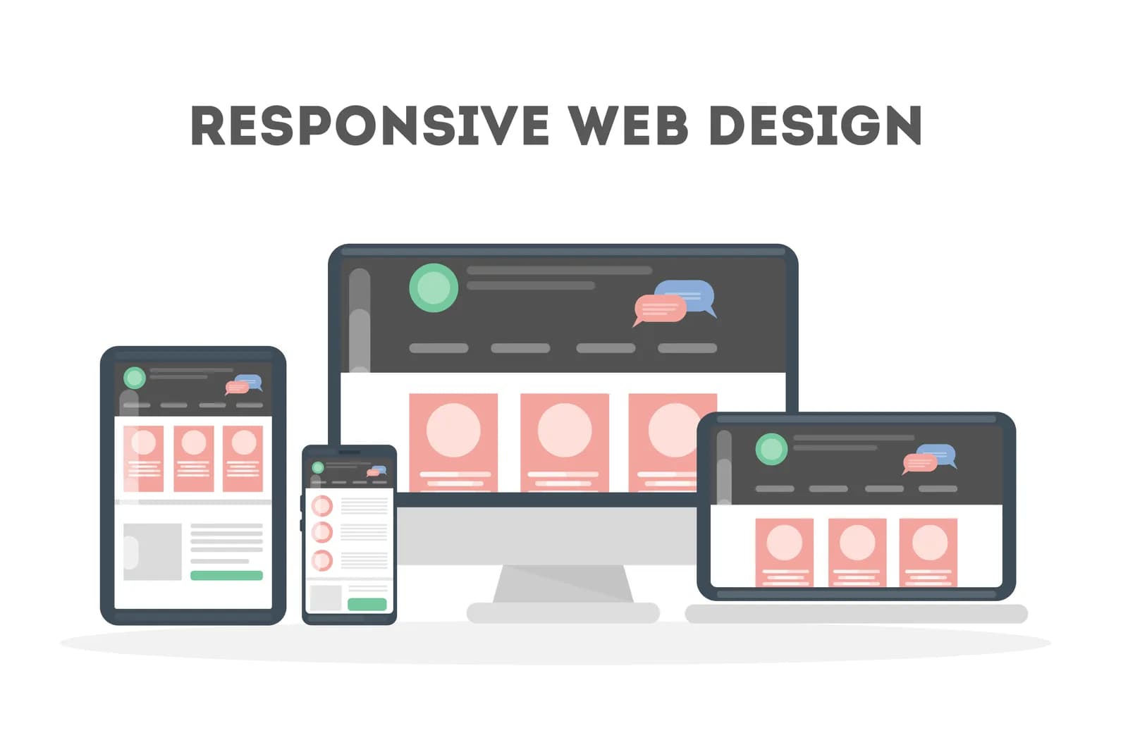
Responsive web design lets one website, on one URL with the same HTML, adapt its layout to any screen width. It is no longer optional: Google has indexed every site by its mobile version since July 5, 2024, so your mobile layout is the one that ranks.
Most businesses believe their site already passes. The page loads on a phone, the menu collapses into a hamburger icon and nothing overflows the screen. Yet the contact form takes two attempts to tap, the checkout button sits where your thumb cannot reach, and the hero image arrives four seconds late on a cellular connection. This guide covers the essentials of responsive web design briefly, then focuses on the harder question: does your site actually work on mobile, how do you measure it, and what should you fix first?
Table of Contents
- What is responsive web design?
- How much of your traffic is really mobile?
- Responsive vs adaptive vs a separate mobile site
- Loads on mobile is not the same as works on mobile
- Breakpoints: design for content, not devices
- Touch UX rules: target size, thumb reach and forms
- Mobile speed: responsive alone is not enough
- How to test a mobile friendly website in 2026
- Mobile-first indexing: what it means for SEO
- Fix the current site or rebuild it?
- Frequently Asked Questions
What is responsive web design?
Responsive web design is a set of techniques that lets a single page rearrange itself for the visitor's screen width, input method (finger, mouse, keyboard) and viewing context. The same HTML goes to every device. CSS reads the available space and decides how the layout should look.
Ethan Marcotte coined the term in 2010 and built it on three ingredients. Fluid grids define columns in proportions instead of fixed pixels, so boxes shrink as the screen narrows. Flexible media keeps images and video from spilling out of their containers. Media queries apply different style rules above or below a given width, so a three-column product grid can become a single column on a phone.
In 2026 two more tools sit alongside that trio. Container queries let a component respond to the width of the box it lives in rather than the whole viewport. Fluid values such as clamp() scale type and spacing smoothly between a minimum and a maximum, without waiting for a breakpoint. Together they retire the old habit of designing for desktop and squeezing the result onto a phone.
Keep one distinction in mind. A mobile friendly website is a usability standard, not a visual trick. Fitting the screen is the starting line. Readable text without zooming, buttons you can hit with one tap, forms that open the right keyboard and pages that load quickly on a mobile network are all part of the same definition.
How much of your traffic is really mobile?
The honest answer is that it depends on your market and your audience, which is why you should check your own analytics before trusting any headline number. StatCounter's worldwide platform data for August 2026 shows an almost even split: 49.36% mobile, 49.11% desktop and 1.54% tablet across all page views.
Individual markets look very different. In Turkey, for example, StatCounter reports that 75.94% of page views came from mobile devices in the same month. Consumer-facing sectors skew further. Contentsquare's 2026 Digital Experience Benchmark, built on 99 billion sessions across more than 6,000 sites, found that 69.9% of traffic came from mobile.
The same report adds the uncomfortable half of the story: the desktop conversion rate was 74% higher than mobile. Traffic has moved to phones, but purchases, quote requests and long forms still complete more easily on large screens. Baymard Institute notes that mobile generates roughly three quarters of store visits for most ecommerce sites, which makes that conversion gap expensive.
This gap is the most practical opportunity in the whole topic. A site that cannot convert mobile visitors as comfortably as desktop visitors is running most of its traffic at reduced capacity. Much of the difference comes from design decisions rather than code: long forms, small buttons, intrusive pop-ups and heavy images.
Responsive vs adaptive vs a separate mobile site
There are three ways to serve a mobile experience, and Google supports all of them. Responsive web design is only one option on paper, but in practice it has become the default. Google Search Central's mobile-first indexing documentation nonetheless recommends responsive design, because it is the easiest pattern to implement and maintain.
| Approach | How it works | Strength | Weakness | Best fit in 2026 |
|---|---|---|---|---|
| Responsive design | Same URL, same HTML; CSS adapts the layout | One codebase, consolidated SEO signals, adapts to new devices automatically | Poor planning can ship desktop-sized assets to phones | Most businesses |
| Adaptive / dynamic serving | Same URL; the server detects the device and sends different HTML | Device-specific optimization | Detection errors, double maintenance, caching complexity | Very high-traffic platforms with dedicated teams |
| Separate mobile site (m.example.com) | Mobile users are redirected to a different host | Quick patch for legacy systems | Duplicate content, canonical and alternate tag management, content drift | Not recommended for new projects |
Separate m. subdomains were common in the early 2010s and many corporate sites still run them. Mobile-first indexing raised the stakes: any content, structured data or meta tag missing from the mobile version is now missing from the version Google ranks. If that describes your setup, plan the move to responsive as part of a website redesign with a complete 301 redirect map.
Loads on mobile is not the same as works on mobile
Checking whether a site is responsive takes seconds: narrow the browser window and watch the layout change. The real question is whether mobile visitors can finish what they came to do. Run these ten checks on your own phone, not a desktop emulator. Each takes under two minutes.
- Zoom check: Can you read body text on the home page without pinching? Body copy below 16 px usually hurts readability.
- Horizontal scroll check: Does the page drift sideways while you scroll down? One overflowing table or image is enough to cause it.
- Thumb check: Hold the phone in one hand. Can your thumb reach the primary action (Get a Quote, Add to Cart, Call) without shifting your grip?
- Mis-tap check: Are menu links or filter options packed together? If one tap in three lands on the wrong item, your targets are too small.
- Form check: Does tapping the email field open a keyboard with the @ key, and the phone field a numeric keypad? Is the submit button still visible when the keyboard is open?
- Pop-up check: Does a promotion, cookie or newsletter overlay cover the content the moment the page loads? Is its close button easy to hit?
- Sticky element check: How much of the screen do the sticky header, chat bubble and cookie bar take up together? On small phones they can crowd out the content itself.
- Landscape check: Rotate the phone. Does the layout break, or does the menu cover the whole screen?
- Network check: Turn off Wi-Fi and load the page over mobile data. Do the headline and main image arrive in a reasonable time?
- Content parity check: Is any information visible on desktop (pricing table, FAQ, address, opening hours) hidden or removed on mobile?
If you fail two of the first four checks, the problem is a design decision and needs rethinking at the component level. Failures on checks five and nine are usually quick development fixes. Check ten matters most for search, for reasons covered further down.
Breakpoints: design for content, not devices
A breakpoint is the width at which a layout changes. The old approach targeted specific devices, such as 375 px for an iPhone and 768 px for an iPad, and it went stale with every new phone release. The current approach inverts the logic: put the breakpoint where your content breaks.
The method is simple. Drag your browser window slowly from full width down to phone size. Stop when a line of text becomes uncomfortably long, an image distorts or the navigation wraps onto a second line. That width is a breakpoint. Most sites end up with three or four meaningful ones.
Real-world screen data still helps you pick a floor. StatCounter's mobile screen resolution data for Turkey, for instance, shows the most common widths in August 2026 clustering between 360 and 414 CSS pixels (414×896, 393×873, 390×844 and 360×800 lead the list). Whatever your market, your design should work flawlessly at 360 px.
| Width range | Typical context | What usually changes |
|---|---|---|
| 360–479 px | Phone, portrait | Single column, hamburger or bottom navigation, full-width buttons |
| 480–767 px | Large phone, small tablet, phone in landscape | Cards in pairs, images beside text |
| 768–1023 px | Tablet, foldable | Two columns, optional side panel, visible navigation |
| 1024–1279 px | Small laptop | Full navigation menu, three-column listings |
| 1280 px and up | Desktop | Capped content width to protect line length |
Treat these ranges as a starting template, not a rule. What matters is the order you write styles in. With mobile-first design, base CSS targets the smallest screen and larger screens are enhanced progressively with min-width queries. Phones then process only the styles they need, and heavy desktop rules never become a mobile burden.
The biggest change in 2026 happens at component level. As MDN's container queries guide explains, a product card can change its layout based on its own container's width rather than the screen's. Size container queries reached Baseline "widely available" status in August 2025, so they are safe for current projects. In practice, the same card renders correctly in a three-column home page grid and in a narrow blog sidebar without extra code.
Touch UX rules: target size, thumb reach and forms
A mouse pointer hits a spot a few pixels wide. A fingertip covers far more. The most common mobile mistake is carrying small desktop links and icons straight onto a phone. Standards bodies and platform owners publish concrete numbers for this.
| Source | Minimum touch target | Note |
|---|---|---|
| WCAG 2.2, Success Criterion 2.5.8 (AA) | 24 × 24 CSS pixels | Legal compliance floor; exceptions apply when adjacent targets have enough spacing |
| Apple Human Interface Guidelines | 44 × 44 pt | Recommended tappable area for iOS controls |
| Android accessibility guidance | 48 × 48 dp | The visible icon can be smaller; padding extends the tap area |
Our practical recommendation: aim for 48 px on primary actions and at least 44 px on secondary links, and treat the WCAG 24 px figure as a floor rather than a target. If you want a visually small icon, extend its clickable area with padding. Accessibility law increasingly makes this enforceable, including the European Accessibility Act for businesses selling to EU consumers; our web accessibility guide covers the legal side.
Thumb reach is the second rule. Someone using a phone one-handed reaches the bottom and middle of the screen easily, while the top corners force a grip change. Put frequent actions (cart, search, contact) in the lower half or a sticky bottom bar, and leave secondary actions such as Back or Close near the top.
Forms are the third, and the most important for conversion. Baymard Institute's 2026 mobile UX benchmark rated 75% of mobile ecommerce sites as only "mediocre," and 93% failed to use adaptive validation error messages. Four changes usually deliver the fastest gains:
- Set the right input type:
type="email"for email,type="tel"for phone,inputmode="numeric"for numbers. The correct keyboard cuts typing errors. - Enable autofill:
autocompleteattributes let browsers fill names, addresses and phone numbers in one tap. - Remove fields: does a first-contact quote form really need company registration number and full address?
- Show errors directly under the field and say how to fix them: "Phone number must be 10 digits" instead of "Invalid input."
Mobile speed: responsive alone is not enough
A responsive site that sends a 2,400-pixel desktop hero image to a phone is visually compatible and technically broken. Mobile users often browse on slower processors and unstable networks, so speed is part of what mobile friendly means.
The business impact has been measured. Deloitte's Milliseconds Make Millions study, which analysed 30 million sessions across 37 brands, found that a 0.1-second improvement in mobile site speed lifted retail conversions by 8.4% and average order value by 9.2%. Travel sites saw conversions rise 10.1% from the same improvement.
Google's Core Web Vitals set three thresholds: Largest Contentful Paint (LCP) under 2.5 seconds, Interaction to Next Paint (INP) under 200 milliseconds and Cumulative Layout Shift (CLS) under 0.1. In responsive builds, these decisions move the numbers most:
- Responsive images: Use
srcsetandsizesso phones download a 400-pixel version and wide screens a 1,600-pixel one. MDN's responsive images guide is a solid reference. - Reserved dimensions: Give images and ad slots explicit width and height, or they will push text down as they load and hurt CLS.
- Lazy loading: Defer below-the-fold images with
loading="lazy", but never lazy-load the main image in the first viewport. - Third-party script discipline: Live chat, heatmaps and ad tags tax mobile processors hardest. Review every one each quarter and remove what nobody uses.
For the full optimization workflow, including how to measure correctly and a 30-day plan, read our guide on how to speed up your website with Core Web Vitals.
How to test a mobile friendly website in 2026
For years the answer was a single link: Google's Mobile-Friendly Test. Google retired that tool, along with the Search Console Mobile Usability report and its API, in December 2023, pointing users to Lighthouse instead. Guides that still send you there are out of date. A reliable test in 2026 has three layers.
1. Lab testing. Lighthouse, built into Chrome, and PageSpeed Insights run your page on a simulated mid-range phone over a throttled network. They report viewport configuration, accessibility issues, heavy images and Core Web Vitals diagnostics. Because lab tests are repeatable, use them to compare before and after each change.
2. Field data. The numbers at the top of PageSpeed Insights and in Search Console's Core Web Vitals report come from real Chrome users (the Chrome UX Report). A lab score of 95 can coexist with poor field data if your audience uses older devices. Field data is what Google uses for ranking signals.
3. Real-device testing. No simulation replaces a thumb. Run the ten-point check from earlier on at least one Android phone and one iPhone, ideally including a device that is three or four years old. Chrome DevTools device mode catches layout bugs but does not reproduce touch precision or real processor slowdowns.
For a quick first pass, try our free site analysis tool, which summarizes technical SEO, speed and core mobile signals in one report. Launching a new site? The SEO launch checklist walks you through pre-launch checks, mobile items included.
Mobile-first indexing: what it means for SEO
Google announced in October 2023 that the transition was essentially complete, and on July 5, 2024 it moved the last desktop-crawled sites to the smartphone Googlebot. The implication is simple: Google sees your site as a phone user does and ranks it on that view. Content that exists only on desktop does not exist for Google.
Responsive sites rarely break this rule because the HTML is identical. We still see five recurring mistakes:
- Hiding content on mobile: Removing long descriptions, FAQ sections or comparison tables with
display: nonebecause they feel crowded on a phone. Accordions and tabs are fine; deleting content is not. - Content that loads only on interaction: Text that appears only after a tap or scroll may never be seen by Googlebot. Reserve lazy loading for images, not body copy.
- Mismatched metadata: If you use dynamic serving or a separate mobile site, confirm that titles, meta descriptions and structured data match across both versions.
- Blocked resources: Disallowing CSS or JavaScript folders in robots.txt stops Googlebot from rendering the mobile layout.
- Intrusive interstitials: Full-screen overlays that cover content on arrival are called out as a negative example in Google's page experience guidance.
Mobile friendliness is not a direct ranking bonus you switch on. When the mobile experience is weak, visitors bounce quickly, engagement drops and Google may not see your full content. Ranking losses are usually the sum of those indirect effects.
Fix the current site or rebuild it?
You ran the ten checks and found problems. Now decide whether to improve what you have or start again. The right answer depends on where the problems come from.
| Situation | Recommended path | Why |
|---|---|---|
| Responsive, but issues with image size, font size and form fields | Targeted fixes | The problems sit in CSS and content; the layout skeleton is sound |
| Responsive, but slow on mobile (LCP above 4 seconds) | Performance project | Focused work on images, scripts and server response is usually enough |
| Fixed-width legacy theme coded for desktop | Redesign | Patching every template costs more than rebuilding |
| Separate mobile site on an m. subdomain | Move to responsive with a 301 plan | Removes double maintenance and content drift |
| Site is six or seven years old and hard to edit | Redesign | The mobile issue is only the visible part of wider technical debt |
If you choose a redesign, insist on a mobile-first process: design files presented phone view first, product and form flows tested on real devices, and written Lighthouse and field-data targets in the acceptance criteria. To see roughly where your budget will land, use our website cost calculator, which gives a range based on page count and features. For the wider list of standards a business site should meet, see our corporate website best practices.
One budgeting point is worth stating plainly, whether your responsive web design project is a patch or a rebuild. Spend first on the flows that make money: contact, quote requests, cart and checkout. A clinic that gets most of its bookings from Instagram and search traffic on phones will gain far more from a three-field booking form that fits on one screen than from animations on its desktop home page. Teams that outsource the work, including to nearshore partners in markets like Turkey where mobile traffic is already dominant, should ask to see real-device test results for exactly those flows.
Frequently Asked Questions
How do I know if my website is mobile friendly?
Open the site on your phone and confirm you can read text without zooming and browse without horizontal scrolling. Then run a mobile test in PageSpeed Insights or Lighthouse. Google retired its Mobile-Friendly Test in December 2023, so these tools plus real-device checks are the current method.
Is responsive design the same as a mobile friendly website?
They overlap heavily but are not identical. Responsive design is the technique that adapts layout to screen width. A mobile friendly website also meets usability conditions such as readable text, adequate touch targets, fast loading and full content parity on mobile.
Does a non-responsive website hurt Google rankings?
Yes, indirectly but significantly. Google has indexed all sites using their mobile version since July 5, 2024. Missing mobile content, slow loading or an unusable interface makes it harder for Google to understand the page and for visitors to stay on it.
What breakpoints should I use for responsive design?
Choose breakpoints where your content breaks rather than a fixed device list. Common starting values are 480, 768, 1024 and 1280 pixels. Since many phones render between 360 and 414 CSS pixels wide, make sure your layout works flawlessly at 360 px.
Do I need to rebuild my site to make it responsive?
Not always. If the site already has a responsive foundation, fixes to images, font sizes, forms and speed may be enough. Fixed-width legacy themes and separate mobile sites usually justify a redesign, which tends to be cheaper and easier to maintain long term.
How big should buttons be on mobile?
WCAG 2.2 requires at least 24 × 24 CSS pixels for compliance. Apple recommends a 44 × 44 point tap area and Google recommends 48 × 48 dp on Android. Targeting 48 pixels for primary action buttons is a safe choice for both accessibility and conversion.
Do I still need a responsive website if I have a mobile app?
Yes. Most new visitors find you through search, social links or ads in a mobile browser and will not install an app at that stage. The app serves loyal users; the responsive website greets new customers. If you want something in between, a progressive web app is worth evaluating, as covered in our PWA vs native app guide.
What are container queries, and should every site use them?
Container queries are a CSS feature that lets a component change its appearance based on the width of its parent container rather than the viewport. They have been widely supported across current browsers since August 2025. They are most useful on sites that reuse the same component in spaces of different widths.
Responsive web design in 2026 is not a feature you add; it is the default state of a working website. A large share of your visitors see you on a phone, and Google evaluates you from that screen. What separates good sites from the rest is going beyond a responsive template to measure touch targets, forms, speed and content parity on real devices.
Run the ten-point check on your own site this week and write down every failure. If you want that list turned into a mobile-first roadmap, our web design service includes a mobile audit that tells you whether targeted fixes or a redesign make more sense. Get in touch and we will review your site's mobile performance with you.
Need professional help with this?
Talk to our team about your project — same-day response, free quote.